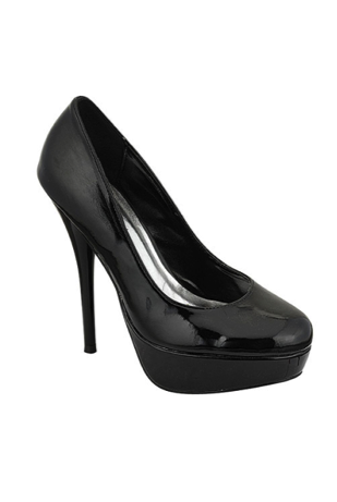
Colour Your Worlde

Artisan Colour

While many things can be fixed in post production, having the right exposure from the beginning can free up time spent in the computer after a shoot for focusing on techniques like stylizing your image. Guaranteeing you have the right exposure is as easy as making sure you have the proper white balance setting for your environment. A well exposed image, with out a doubt, makes for a better print.

Daniel Sone for Photo Tuts shows you how to get the proper white balance for your camera. He also gives an explanation on how to combat the color cast of different lighting situations.

In this tutorial you'll see why setting your camera to the correct White Balance not only saves you a great deal of time in Photoshop, but also enhances image quality. We'll talk about color temperatures, White Balance presets, and how they affect your photographs. Learning to read the light and set your camera accordingly is essential for all photographers, from beginners to the masters.

Posted via email from Artisan Colour

It's amazing when you start thinking about a subject how many things seem to pop up. I've run across a couple of blog articles posted this week that focus on color theory in design, and wanted to share.

Smashing Magazine today posted the first in a 3 part series entitled 'Color Theory for Designers'. Part 1 concentrates on the meaning behind different color families. They dissect warm colors, cool colors, and neutrals with website design samples to support each color scheme. Check back for parts 2 & 3, where they discuss how hue, value, saturation, tone and shades affect the way color is perceived and how to create effective design color palettes.

Color in design is very subjective. What evokes one reaction in one person may evoke a very different reaction in some one else. Sometimes this is due to personal preference, and other times due to cultural background. Color theory is a science in itself. Studying how colors affect different people, either individually or as a group, is something some people build their careers on. And there’s a lot to it. Something as simple as changing the exact hue or saturation of a color can evoke a completely different feeling. Cultural differences mean that something that’s happy and uplifting in one country can be depressing in another.

We Make Money Not Art posted a book review of Chroma: Design, Architecture and Art in Color. The book by interior architect Barbara Glasner and Petra Schmidt explores the creative process behind color selection of artists and architects.

Publisher Birkhauser says: Designers and architects have to make decisions regarding color every day. But how does one find the necessary inspiration? The appropriate color? How do other designers and artists deal with the issue? With "Chroma," the Greek word for color, as its title, this illustrated book provides answers to these questions and makes it clear that color is much more than mere decoration - it is one of the central problems of creative work. In the process, "Chroma" embraces the sensuous experience of color, inspiring and seducing the reader with unusual projects, from industrial products to color field painting. The book presents works by younger designers like Stefan Diez and Arik Levy as well as famous artists like Ellsworth Kelly.

Can't get enough of color? Check out these sites

Color Contrast & Dimension in Design has an interactive presentation that explains color theory, and has examples of how it is used in design and paintings. It covers the power of color, the physiology of color, contrast, hue, and dimension.

Colour Lovers is a fun site where you can create your own color palette and pattern, share it with the Colour Lovers community, and even get rated. They track color trends and offer loads of inspiration.

This is a fun little chart that shows food in season by time of the year and color coded like a rainbow. Found [Via]

Posted via email from Artisan Colour

You have your mission statement written, and the perfect tag line all picked out. Most people's first step to building your company's visual identity and brand is the selection of your company logo. This important visual image projects to the world what your company represents, and needs to function well in different contexts; website, letterhead, business cards, signage & advertising. A well designed logo can establish the first crucial impression of your business and even build customer loyalty.

The colors chosen for your logo can convey more than you may think. Certain colors have an instant recognition in people, and can even evoke an emotional response. Alina Wheeler author of Designing Brand Identity offers this advise "Color is used to evoke emotion, express personality, and stimulate brand association....The ultimate goal is to own a color, a color that facilitates recognition and builds brand equity." Think of the big brands that are immediately recognizable by their brand color. Coca Cola owns the color red, McDonald's golden arches, Home Depot hangs their tool belt off the color orange, UPS even replaced their company name with the logo color in their ad campaign 'What can brown do for you?'. The colors you choose do matter, because colors have meaning. There are many sources on the web that specialize in color theory, here are a few that are specific to logo color selection - A Guide to Choosing Colors for Your Brand & Brand Identity: The Importance of Color.

While your logo is the building block of your brand, your brand is not just your logo. Your brand is the culmination of the sum of things your business represents. Including your logo, your corporate colors, your office space, employees, company values and associations, your marketing material and much more.

Lets focus on marketing material. Vision dominates all other senses. People are 65% more likely to remember your brand if you show it to them visually than through any other method. A unified look to your logo and company colors that are used as building blocks in all of your marketing material can help identify you in a competitive market. The imagery used for your marketing is also key. If you are in the food business it is important that the food represented on your menu board, window graphics, and print ads look scrumptious and good enough to eat. It is worth it to hire a professional photographer that is experienced in composition, lighting, and product styling. Of course, accurate color representation in the printing of your marketing material and signage is critical.

Using creative promotional products can be like a silent salesperson for your business. Company refrigerator magnets, coasters, and bumper stickers are easily passed out, mailed and distributed. If you are throwing an event, hand out gifts that have your company logo on them. Adding a car magnet or vinyl logo to your vehicle is an affordable moving billboard that can reach thousands of people. The more areas you drive to around town, the more eyes that will see your message. Whatever you pick, all should bear your logo and contact information.

Remember your brand will develop over time as your company grows. A strong brand connects with your prospective clients and solidify relationships with your existing clients. The avenues you take to promote your company are integral with how your brand will ultimately be perceived.

Posted via email from Artisan Colour

The Arizona Fine Art Expo is a annual event that sets up a temporary home in North Scottsdale. This is no ordinary weekend art fair. The event opens today and will run through the end of March. They present over 100 national and local artists who will be in attendance through the duration of the show. Many of the artists will be working on pieces in their space. It is a great opportunity to meet the artists, ask questions, and see their process up close. There are also hands-on classes, seminars, and live music scheduled as part of the three month experience. One day may not be enough time to see it all, season passes are available.

For more information about the expo, location, and participating artists visit their website.

The Arizona Fine Art EXPO, produced by the award-winning Thunderbird Artists, showcases more than 100 nationally-acclaimed artists applying their artistic talents in studios. This event gives patrons unprecedented access to watch the world’s most gifted artists in Arizona. The artisans sketch passionately in pencil; charcoal and pastels; sculpt and fire clay; drill, chisel and carve stone; paint in all media; sketch and dye batiks; carve, stain and etch gourds; design lost wax casting; solder and weld jewelry; assemble mosaics and more. Art is for sale and commissions welcomed.

Posted via email from Artisan Colour

In the January issue of The Big Picture magazine they ran a feature article discussing the companies that use machines with white ink. Their cover is reminiscent of the Beatles White Album. Like the Beatles were to music, machines with white ink are revolutionizing the market.

Our Océ Arizona 350GT is widely recognized by the industry as having a superior print quality, and has a white ink option. Big Picture approached us to participate in their article, we were happy to extol the virtues of our equipment and company. Here are some excepts from the article.

Making White Noise - by Jake Widman

The company's latest acquisition: an Océ 350GT Arizona flatbed printer, which is versatile, Cook adds. "We have the roll-to-roll option and can print up to 86-inches wide, and we can print on the flat substrate up to two-inches thick. With the white-ink option, it opens up new markets. We do a lot of work on supplied materials, and artists bring in ceramic coaster or tiles and we output images onto those."

Cook recently called on the 350GT's white-ink capabilities in a job for an auction house dedicated to classic and high-end automobiles. When a car is sold, the auction house has a photographer take pictures of it from multiple angles. "For years, they just archived those photos and never did anything with them," Cook says. "They wanted to expand, and we were asked to come up with ideas high-lighting our capabilities for their marketing group"

One result: a 24x30-inch print of three views of a 1940s Buick station wagon. The image was provided by the auction house, archived by Artisan, and then printed on 3mm brushed silver Alcan Dibond aluminum composite. "The photos have white elements that would not work without white ink, such as the whitewall tiers and the chrome highlights," Cook says. "In addition to printing white in those areas, we put white spot channel behind the whole image to ensure it would be opaque and the colors would pop."

Our thanks to the folks at The Big Picture magazine!

Posted via email from Artisan Colour

Another holiday weekend is upon us. With the extra time it is a perfect opportunity to experiment with some new photo techniques. HDR (High Dynamic Range) Photography has been gaining popularity over the past several years. This method of combining multiple exposure images can create some stunning results. While many lean towards the surrealistic, the process can also be used to create a more realistic images by retaining detail in highlight and low light areas that can not be accomplished in camera with filters. Winter skies and low light situations, like a New Year's Eve firework display, are a perfect time to try it out.

Two softwares are most commonly used to achieve this look, Photoshop and Photomatix. Here are some tutorials to get you started that utilize both programs.

Stuck in Customs by Trey Ratcliff produces some amazing images. He uses Photomatix Pro to generate his images.

The Definitive Guide to Realistic High Dynamic Range Images posted on Fickr by Paul Omernik discusses how to use HDR photography to create a balanced image.

Vanilla Days photo blog by Peter Carr also uses Photomatix to produce his images.

PhotoshopCafe illustrates how to use Photoshop and Photomatix to get different HDR looks.

For a technical explanation of HDR photography check out Cambridge Colour's tutorial by the University of Cambridge in the United Kingdom.

Many of the tutorials that feature Photomatix also offer a coupon to save on the purchase of the software.

Have fun! Don't forget to get your images printed. HDR photos look amazing when printed on FujiFlex paper.

Posted via email from Artisan Colour

Perhaps you are living in tight quarters with limited space, or would just like the convenience of being able to tuck away your table when not in use. This innovative table from Ivydesign doubles as wall art and a table. Mounted to the wall, when not being used as your eating area, it folds up in to an attractive framed photo. You can use and switch out your own artwork in the frame. The only drawback is that it looks like they currently don't ship to the US. I guess I will have to make my own or wait until Ikea knocks it off. Found [Via]

Picture Table

For private habitations, hotel rooms, coffeehouses, lounges, multifunctional spaces,... A usually space consuming, functional piece of furniture can be turned easily into a decorative, space saving object. The table mounted on a side wall can be rotated towards and fixed on the wall. The poster can be chosen and exchanged by yourself.
Size: 130 x 85 x 78cm


Posted via email from Artisan Colour

One of our very favorite clients, Christine Taft continues to bring beauty to the world by agreeing to be a contributing artist to the website Fine Art On Demand.

Fine Art On Demand is a community based, internet art market bringing fine art to the world, while supporting local schools, non-profits and charities. The company manufactures customized fine art content consumer products such as greeting cards, calendars, art books, poster art and calling cards "on demand".

According to Christine, "the program is centered around a customized internet booth in which supporters of your organization buy items they would normally purchase in places such as grocery stores, pharmacies or gift shops. New, value added products are being conceived all the time which is proving to be very popular and will definitely add substantially to your charities funding". The biggest takeaway we get from Christine is that not only will the artist get much needed exposure and sales but they will be supporting local schools, non-profits and other charities as well.

So, if you are an artist looking for sales to the corporate, fine art based, marketing and promotional markets then consider joining talented people like Christine Taft on an exciting fund raising adventure with the good folks at Fine-Art-On-Demand.

Posted via email from Artisan Colour

Looking for alternate signage ideas for your product? The floor is often the perfect place to add to your message and literally stop consumers in their tracks. Every retail space has a floor, and each floor is a potential advertising canvas.

By utilizing floor space, these graphics can be used as a directional tool to guide customers to the desired location in an interactive way. Strategically placed in point of purchase locations through the store they can increase sales of your product up to 30%. With a low cost per square foot to produce, and a durability to withstand high foot traffic for several months, they offer a high return making them one of the most inexpensive advertising mediums.

Floor graphics are made up using a base vinyl and a specially formulated over-laminate for the floor. This over-laminate has a rough texture to prevent slipping and protects the print from foot traffic. The vinyl is easily removable and leaves no residue on the floor. Making it also easy to change out for future campaigns.

Most commonly seen in grocery stores, floor graphics can be used in many ways beyond the frozen food section. They are perfect for trade shows and special events. A logo placed at the entrance of your lobby can promote company pride and help build your corporate brand. Or create three dimensional illusions like this image of a 'hole' in the ground that Publicis, an advertising agency in Brazil, created for an anti-drug campaign at Mackenzie University.

Contact an Artisan Colour representative to learn how to create your own floor graphics.

Posted via email from Artisan Colour

On December 4th the monthly First Friday Artwalk will be held in the Downtown Phoenix Art District. The Phoenix Art Museum has also selected that day to mark the beginning of their 50th anniversary celebrations. Their 50th Anniversary First Friday Party is open to the public and promises to be a multi sensory experience. Not only will the PAM be showcasing 50 new acquisitions from notable artists like Andy Warhol, Phillip C. Curtis, James Turrell, and more, they will also have live bands, DJ's, as well as hors d'oeuvres and cocktails. The new artwork will eventually be distributed around the different galleries in the museum. Through January 3, 2010 they will be on display in the Steele Gallery. Come out and help the Phoenix Art Museum celebrate 50 years of cultural enrichment in The Valley of the Sun.

50th Anniversary First Friday Party

Everyone in the Valley is invited to celebrate Phoenix Art Museum's Golden Anniversary at a free First Friday event, December 4, from 6 p.m. to 10 p.m. Since 1959, the Museum has served as the cornerstone of Phoenix's art and cultural community, providing the people of Arizona with great art from around the world and amazing cultural experiences. The 50th Anniversary party promises to be no exception offering a jam-packed evening full of engaging musical performances, live DJ sets, signature cocktails and access to all of the Museum's galleries.

Posted via email from Artisan Colour

Many artists have learned the advantages of reproducing their art by printing on to canvas, commonly called giclée printing. What is giclée printing? Giclée (pronounced “zhee-klay”) is a French word that means “to spray or spurt liquid.” One distinction between giclée printing and using any old ink-jet printer to print on to canvas is that giclée prints are created using professional 8-Color to 12-Color ink-jet printers. The technology of a professional printer sprays incredibly small pixels of rich, vibrant archival inks onto the canvas at a very high rate of speed. This system produces amazingly smooth and vibrant images true to the colors of the original painting with such precision that no dots, blurs or lines are discernible to the eye.

There is a multi-stepped process that goes in to creating a quality giclée print or art reproduction on canvas. First, the image is digitized, either by a scan or a high resolution photo capture. The image file is analyzed for color balance, contrast, brightness, and any scratches or dust specks are removed using imaging software, like Photoshop. Before printing the final product, the image is proofed. Test strips are run to ensure color accuracy and see if any additional corrections need to be made. When satisfied with the proof, the final giclee art prints are sized and printed. The final print is coated with a liquid UV protective laminate and often finished by stretching around a wooden frame to give the appearance of an original painting.

Giclée art reproductions are a great option for artists and photographers who would like to mass produce their work, but print only as needed, or on-demand. Once an image is digitally archived, an infinite number of additional giclée reproductions can be made with minimal effort and will appear the same as the original giclée produced.

To learn how Artisan Colour can print your artwork on to canvas visit our website.

Posted via email from Artisan Colour

Looking for something fun to do this weekend? The 13th annual Hidden in the Hills Artist Studio Tour and Sale presented by the Sonoran Arts League will begin tomorrow and will run through Sunday the 22nd, 10 am to 5 pm daily. If you can't make it this weekend there is a second chance to attend over the holiday weekend November 27, 28, & 29th. It is a free self-guided tour through the Sonoran Desert Foothills with 46 studios and 150 artists participating in the event. Art being displayed will range from painting, jewelry, ceramics, pottery, photography, to sculpture, glass, and even gourd work. It is a great chance to meet the artists, learn about their process, and support our local art community.

We wish friends of Artisan Colour who will be participating in the event a successful show. For more information on the studios that will be participating, a map of the tour, and more; visit the Hidden in the Hills website. Come out and enjoy some art!

Posted via email from Artisan Colour

Tonight is the grand opening for a new venue in Mesa launched by Julio Cesar Chavez. The 30,000 square foot facility is a boxing themed entertainment complex that includes a restaurant, bar, arcade area, a World Boxing Council Legends of Boxing Museum, and event center that will eventually host their own boxing cards. Chavez says it will be "The first of many" with hopes to open similar complexes in other cities.

We were honored that to be selected to print the posters for their museum as well as other wall installations in the building. Being involved in the design process, we know that that working on this project has been a real labor of love for everyone involved and they are very excited for the opening. We wish them the best of luck and success!

Opening ceremony is scheduled for 6 pm tonight. Julio Cesar Chavez Campeones is located on the southwest corner of Country Club Road and Southern Avenue in Mesa. For more information visit their website.

Cesar Chavez opens Mesa complex - Odeen Domingo for Arizona Republic

What more can he do? His toughness, pride and lightning-quick yet thunderous hands already had led him to glory.

Julio Cesar Chavez, 47, is considered the greatest Mexican boxer in history. He won 108 of his 116 fights, earning six world titles in three weight classes. A star in his sport. A hero to his country.

What more can he do?

Yet there he was Monday - in a white, pinstriped suit - standing inside a boxing ring at a 30,000 square foot venue in Mesa. The $4.5 million venue Chavez was promoting was "Julio Cesar Chavez Campeones"...

Posted via email from Artisan Colour

Flickr has expanded their relationship with photo-licensing giant Getty Images. In July 2008 they launched Getty's Flickr Collection. When it was created Getty alone decided which images were commercially viable, collecting more than 60,000 images. Now Flickr members can nominate their own images to be added to the program.

"A submission should include exactly 10 images that represent what you consider to be the best of your work. The Getty Images creative team will evaluate submissions based on style, subject matter, and technical skill," Andy Saunders, Getty's vice president of creative imagery, said in a statement. "If some or all of the photos--or other images from your photostream--are selected for the Flickr Collection on Getty Images, you will receive an invitation via FlickrMail. This invitation will clearly show Getty Images' initial selection of images and introduce the enrollment process."

The partnership is an interesting confluence between the old-school world of stock photography and the nouveau era of digital photography and the Internet. With digital SLRs and the Internet, high-quality photos are easier to come by, leading to the arrival of several "microstock" companies that sell photos on a royalty-free and relatively inexpensive basis. It's hurt professional stock photographers, but it's provided extra income to any number of enthusiasts and amateurs.

This acknowledgment of the average user's merit is a big step in the global reach and marketing of images. It can also help reduce unauthorized usage theft and giving the images monetary value. Found [Via]

Posted via email from Artisan Colour

This is a question we get asked almost on a daily basis: How big of a print can I make with a image that was taken by a 8, 10, or 12 megapixel camera? The answer is two fold. Yes, there are limitations of each camera and the maximum file it will produce, in turn limiting the size enlargement you can produce without showing any file loss. However, the other factor to consider is the viewing distance of your print.

The human eye has a good, but limited perception of resolution. This means that beyond a certain level of detail there is nothing much to be gained by ever higher resolution images. The trade-off that occurs depends on how far your eyes are away from the print. Did you know that the average billboard print is produced at 2 to 20 dots per inch? For that format the lower resolution is acceptable because the print is viewed from yards away, and your eye fills in the detail.

Of course, much of this has to do with the expectations you have for your print. If you are do not want to see any file loss or pixelation in the print, even when viewed up close, it is best to try to stay above 125 DPI at your final output size. For a quick reference, take a look at the chart below.

MP Count 6 8 10 12 14 16 18 20 22
Print size (125 DPI) 16x24 18.4" x 27.6" 20.5" x 30.9" 22.7" x 33.9" 24.3" x 36.7" 26.1" x 39.2" 27.6" x 41.7" 29.2" x 43.8" 30.7" x 46.1"

If necessary you can push your file larger than those restrictions, often with amazing results. Typical areas that will show file loss first are large areas of one color or gradients, like a sky. The gradient may not transition smoothly and start to band, or you may see pixel noise in parts of the sky. Other things to keep an eye out for are halos. Those can usually be seen in places where the detail of an image meets a large area of gradient, like the horizon line of a landscape image. Most of these can be caught on screen. Remember to zoom in and view your image close to look for any artifacts. If you can see it on screen, you will see it on the print.

There are also softwares available that can optimize your file for output, like Genuine Fractals. The thing to remember when using softwares like these is that it will not fill in the detail of your image. What it does do an amazing job at is making the transition from a small to large image smoother. Instead of the jagged pixel lines left over from a overly stretched file, it will fill in the dots so to speak, and keep the lines more even.

Print size, file resolution, and viewing distance work hand in hand with digital printing. One ultimately affects the other. Remember to consider where and how the print is going to be used when you determine the size you would like printed.

Posted via email from Artisan Colour